
Beer cans are the new album covers.
Music is digital now. Instead of thumbing through CDs or records at my local record shop, I spin through my Spotify playlist. I miss the days of finding that obscure album for cheap and the anticipation of waiting to listen to it when I got home.
The real joy of going through all those albums was seeing the album artwork. To this day, I can still see those album covers from the plethora of one-hit-wonder ’90s grunge and indie bands (Hello bronze animal band on The Presidents of the United States of America album!). There’s even a Twitter account called Images That Could Be Album Covers that highlights arty, esoteric photos that definitely should be album covers.
Nowadays, I visit my local bottleshop to get my album-cover-art fix. The rows and rows of beers at your local bottleshop are covered in a cornucopia of artwork on cans and bottles. It’s all there: wild illustrations, moody artwork, funny photos, punny names, mascots and much more.
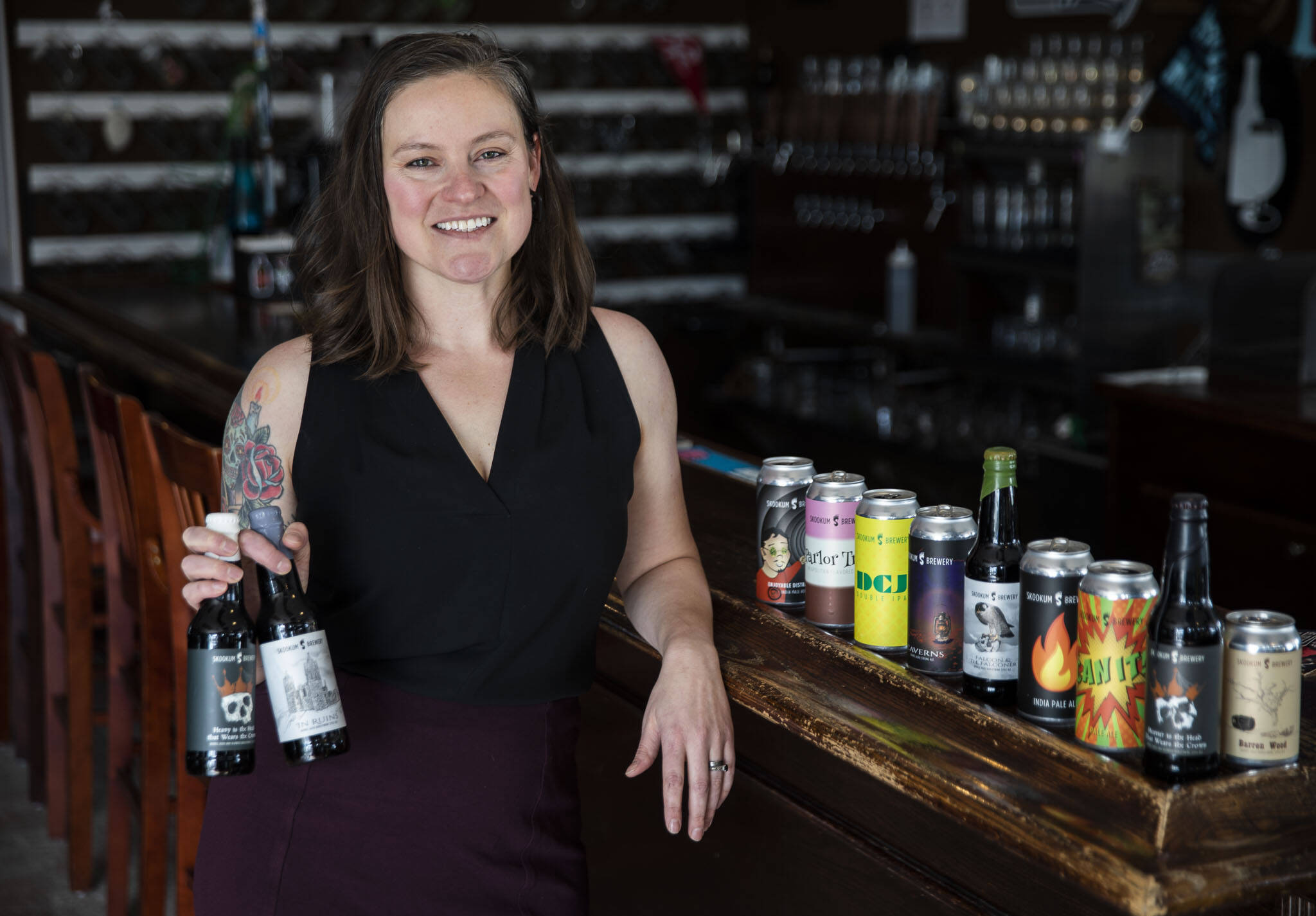
Breweries regularly turn to artists to make their sudsy liquids look good on the outside and garner attention beyond what might be inside. One of those artists is Alyson Osborn. The Bothell artist, who started her own graphic design company, Handsome Meatball, in 2017, has been creating works of art that grace beer cans and bottles from local breweries like Skookum Brewery and Crucible Brewing for the past few years.
“Breweries want something that will stand out amongst so many beers on the shelf,” said Osborn. “If you go into a bottleshop and look at all the labels, if it’s striking or funny you’ll be more likely to try it. They know that cool artwork is a way to catch a customer’s eye.”
Pint cans have transformed the craft beer industry. Instead of six packs of bottles or 12-ounce cans, many small or mid-size breweries have turned to four packs of pint cans as the main delivery method for their beer. One of the effects of that change has been the can artwork revolution. Craft beer nerds regularly peel off the stickers on cans and affix them to walls, fridges, vehicles and more. Head to The Republic Bottleshop in Marysville and check out the bathroom for a wall-to-wall display of beer can artwork.
Pint cans give artists more space to create, and because there’s no holder that blocks the art like six packs of bottles, it gives them clear sightlines. It also presents unique challenges.
“Cans may seem simple because you design the artwork flat, but as a designer you have to think about the fact it’ll be seen from many different angles because customers will see different parts as it rotates,” said Osborn. “How will you catch their eye even if the can is turned.”
Andrea Friesner, who is Crucible’s admin manager, remembers opening the first draft of can artwork for a witch-themed beer she had brewed and screaming with delight because Osborn had captured exactly what was in Friesner’s imagination.
“She has an innate ability to take our most vague descriptions, sometimes ridiculous visions and artistically challenged sketches, and transforming them into eye-catching pieces of art,” said Friesner.
Osborn is a longtime craft beer fan herself. She regularly waits in lines for exclusive beer releases and often does some of her best work at local breweries and bottleshops. While meeting with a client at Skookum a few years ago, Osborn struck up a conversation with then-Skookum brewer Max Neumann. He wondered why she wasn’t creating labels for them. Soon after, Osborn’s artwork began gracing the brewery’s cans and bottles, including many of its barrel-aged offerings like Heavy is the Head and Caverns.
“If you see those Skookum bottles you remember them; they’re iconic,” said Osborn. “Skookum was fun to work with because they understood their style and demo so well.”
Osborn creates brands and works with breweries to dust off tired brands. For any of her work, she’ll pay the brewery or bottleshop a visit, have a beer, talk to customers. You know, research.
“I like to come in, sit down next to someone and ask them what they like and why they like it,” said Osborn. “It’s important to know what the feelings are around the brewery. What makes the brewers tick. Why beer is important to them.”
Osborn is currently working with a variety of clients preparing to establish a new brand or open a new business. She’s working closely with Brian Hoorn, who is developing a brand for a beer and wine bar he’s opening in a yet-to-be-determined location here in the Puget Sound region.
“Alyson is great at deciphering my frenetic musings and translating them into something tangible and artistic,” said Hoorn. “There’s a back and forth between font, shapes, colors and size and more, and she makes it all feel collaborative.
“But make no mistake, she’s the artist,” Hoorn added, laughing.
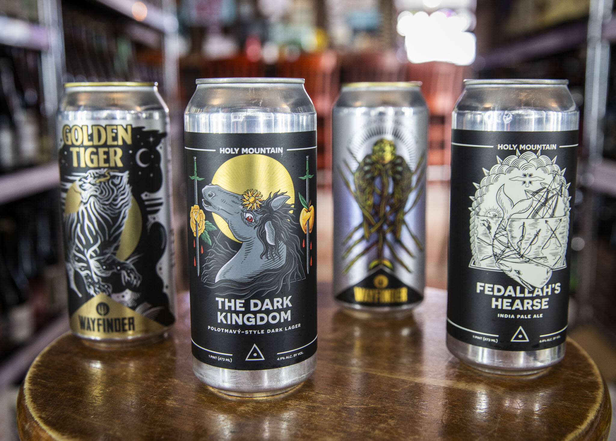
Holy Mountain Brewing and Wayfinder Brewing are two of Alyson Osborn’s favorite beer brands. (Olivia Vanni / The Herald)
Osborn’s Favorite Beer Brands
Holy Mountain Brewing, Seattle. “Great at targeting their demo while staying on brand. Constant design and color pop. Heavy metal feel.”
Wayfinder Brewing, Portland, Oregon. “Iconic and easily recognizable. Clean designs mixed with drawn aspects.”
Revolution Brewing, Chicago. “Can recognize their brand on any can and grab it off the shelf with confidence. The Deep Wood series adds a special touch with extra detailed drawings.”
Osborn’s Favorite Designs
Falcon and the Falconer, Skookum. “This one was fun. Max Neumann was the lead brewer on this one and had the idea of a falcon and the skull. I knew the design had to stylistically align with the other Skookum barrel-aged beers that I had worked on. I used the hand-drawn approach that I had used with the other labels to create consistency in the branding. Before I colorized the falcon, I had to do a few quick sketches to get the right body position of the bird compared to the skull. Once the main imagery was decided upon, I completed the label with a subtle but depth-creating background. I wanted the background to be desolate while still complimenting the main elements.”
Eye of the Beerholder, Crucible. “This was the vision of Shawn Dowling at Crucible. He is a Dungeons and Dragons enthusiast and knows that a significant amount of the local demographic also enjoys D&D. He also loves a play on words and wanted that to come to life with this one. After doing a bit of research, I knew this design had to be a combination of “dirty” and “bright.” I wanted to give the “Beholder” an organic and fluid feel so I hand-drew the outline and then colorized it digitally. I used the beer foam to balance the dynamic movement of the beholder. The beer color was also used to glow and reflect in the eyes of the beholder. The background needed to be simple at this point to add depth while not overwhelming the rest of the design.”
Caverns, Skookum. “Former Skookum brewer Hollis Wood had the name but not much else for this beer. I was given the freedom to design. I did many rough sketches of stalagmites and stalactites within a cavern. I wasn’t getting the right depth or focus. The design needed a source of light to create depth and a focal point. After reviewing the other designs on Skookum beers, I decided on an Old Western-style lantern to align with the other vintage elements on other labels. I didn’t want the background elements to distract the eye from the lantern but I did want to play with color to make sure the label still “popped” off the shelf.”
Sound & Summit
This article is featured in the spring issue of Sound & Summit, a supplement of The Daily Herald. Explore Snohomish and Island counties with each quarterly magazine. Each issue is $4.99. Subscribe to receive all four editions for $18 per year. Call 425-339-3200 or go to soundsummitmagazine.com for more information.
Talk to us
> Give us your news tips.
> Send us a letter to the editor.
> More Herald contact information.
Gallery


